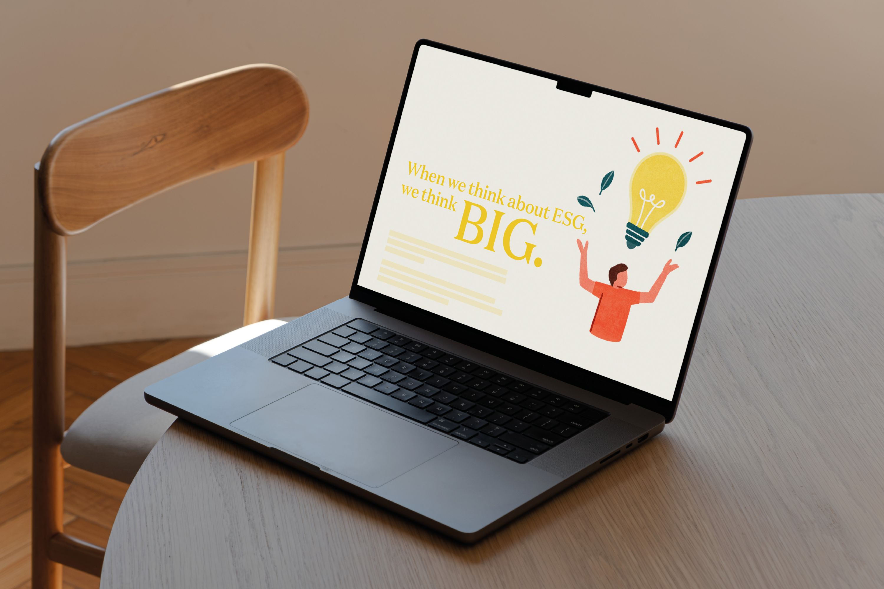
Showing Stanhope’s ESG story through illustration
ESG can be difficult to communicate without slipping into familiar visual territory. Stanhope wanted a more ownable way to tell the story.
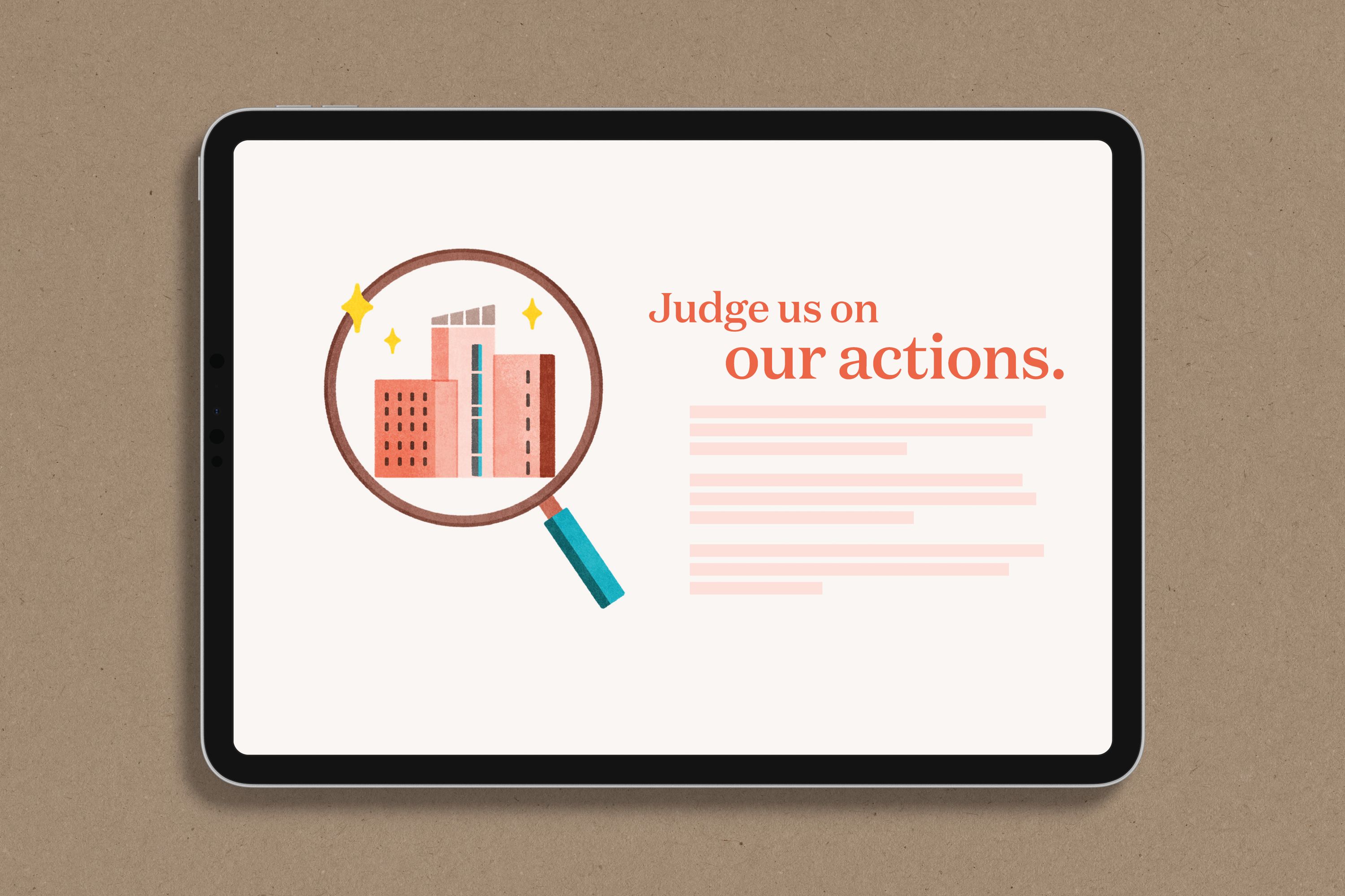
Covers developed an illustration direction built around warmth, narrative and bold use of the existing brand palette.
Client: Stanhope PLC
Location: London, UK
Scope: Creative direction, deck design
A flexible illustration suite for ESG communications
The process
The brief was shaped collaboratively with the client, using FigJam to define what the illustration needed to do: feel warm, tell a story and make confident use of Stanhope’s brand colours.
Yo Hosoyamada was the right fit for the project. Her use of colour and texture, combined with a background in architecture, brought the right balance of character and relevance for a business rooted in the built environment.
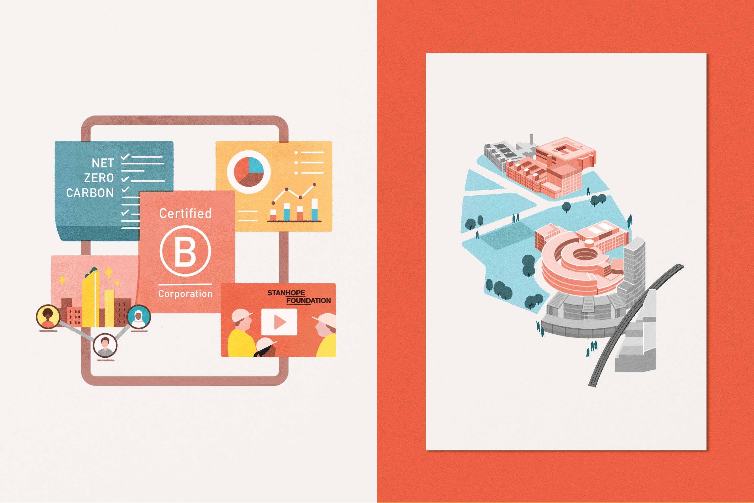
Together, we pulled ideas from the supplied ESG content and translated them into a visual language that could support themes including Stanhope’s B Corp status.



The results
We created a distinctive illustration suite that gave Stanhope’s ESG communications more warmth and personality while staying firmly within the existing brand.
The work was first used in the annual ESG report, then extended into further illustration sets the following year – a useful sign that the visual language had room to grow.


Kind words from Alison:
“Adam is great to work with and is really quick to understand what you want. He has fantastic creative solutions to make the content stand out and look its best. He guides you through the whole process in a clear and calm way which makes working with him a breeze!”
Alison Summers
Marketing and Communications Manager, Stanhope
Project credits.
Client: Stanhope PLC
Location: London, UK
Scope: Creative direction, deck design
Illustration: Yo Hosoyamada

