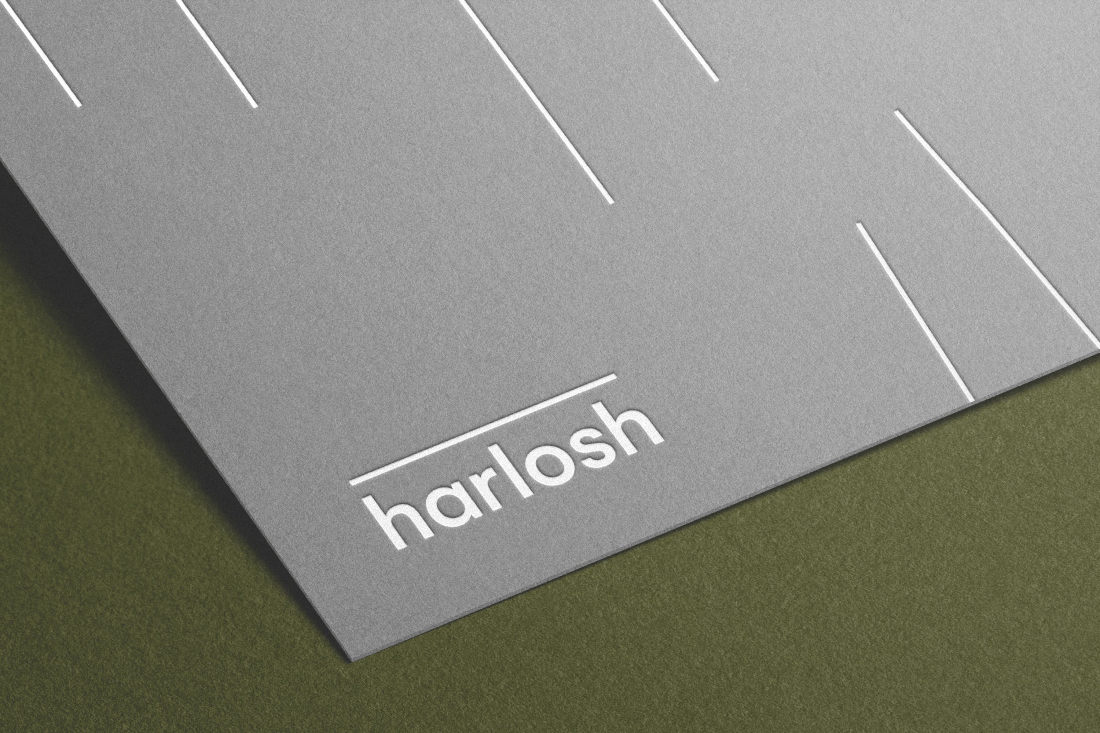
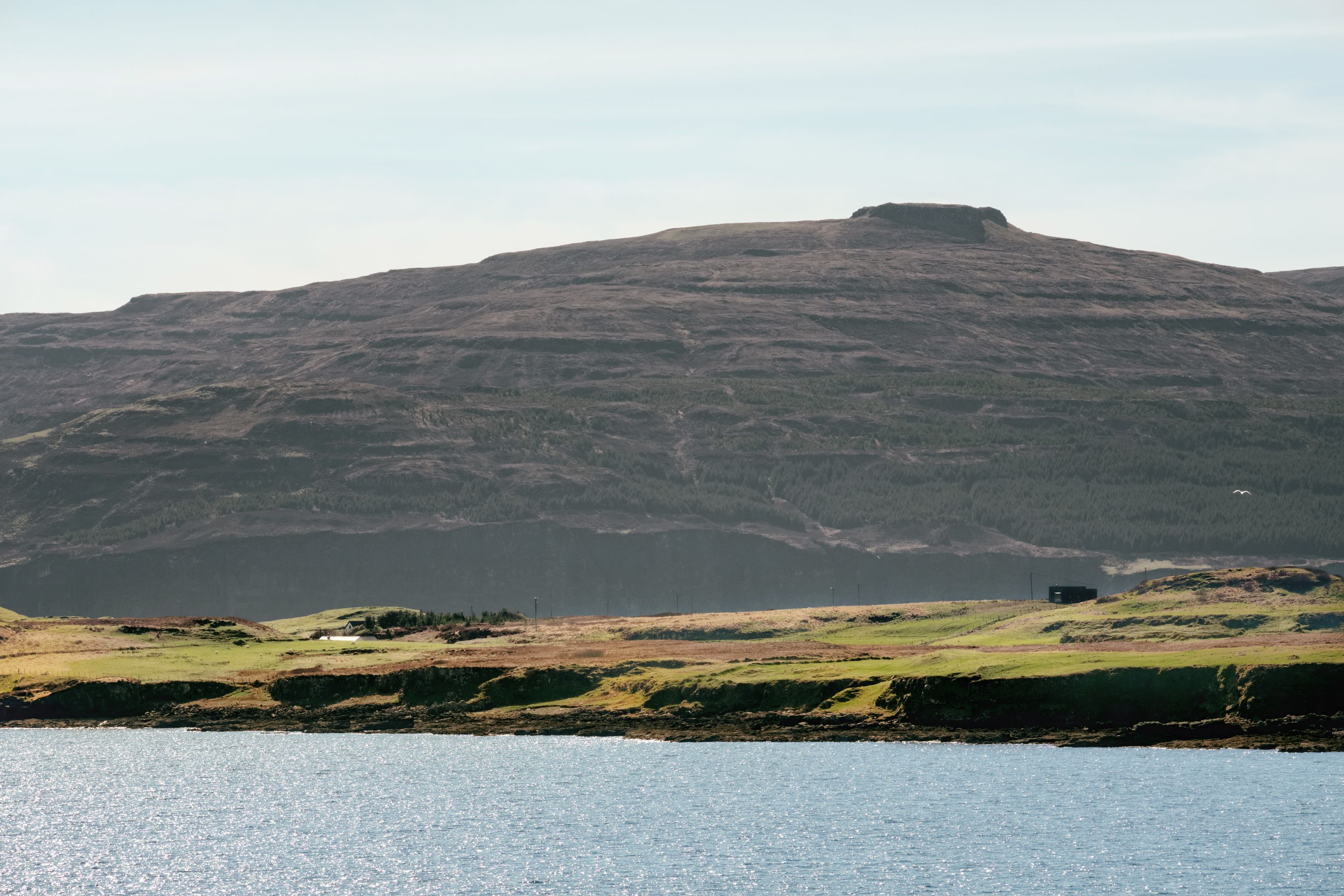
Located on the Isle of Skye, Harlosh required a brand identity to bring its two architect-designed holiday homes under one roof.
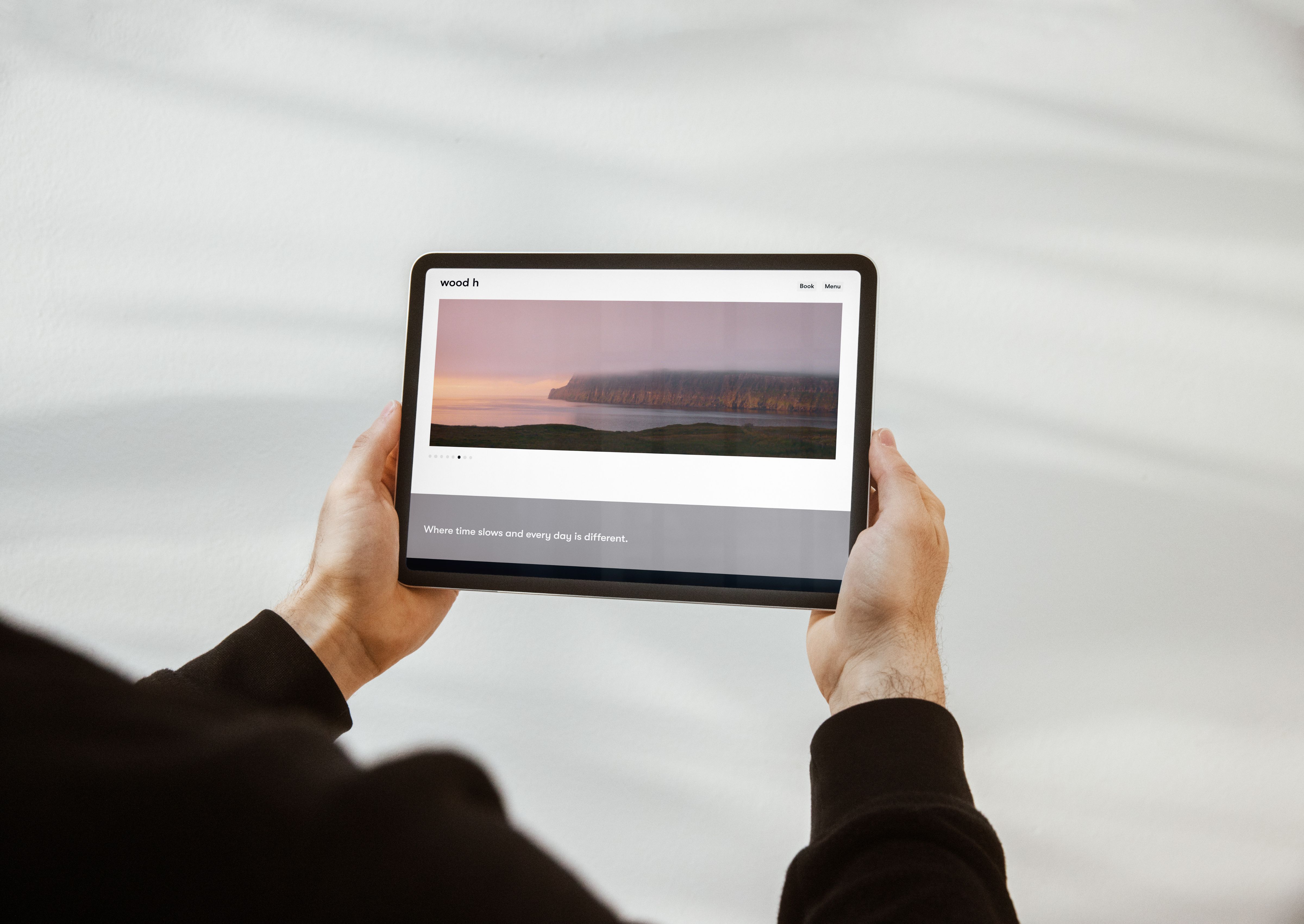
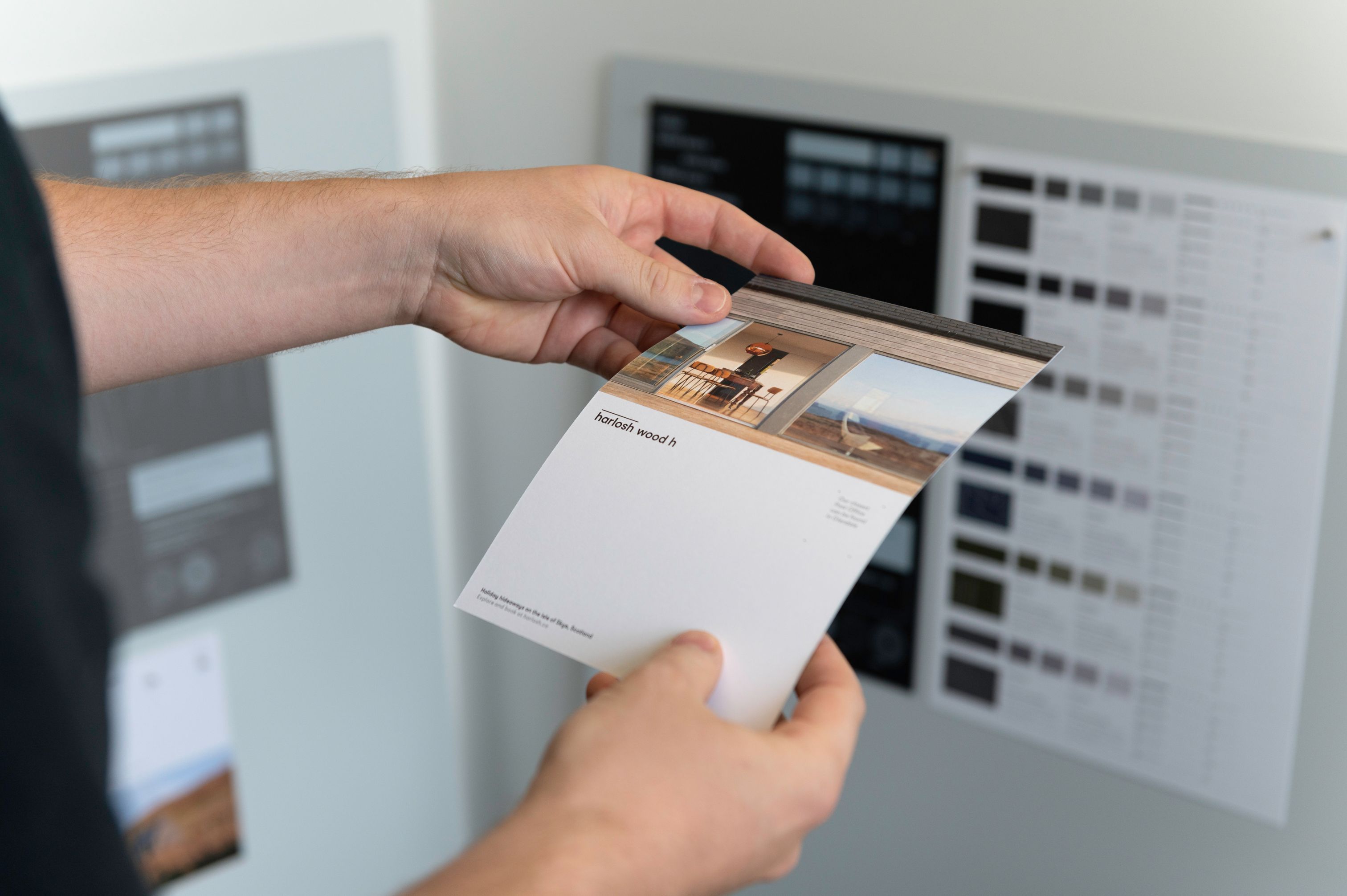
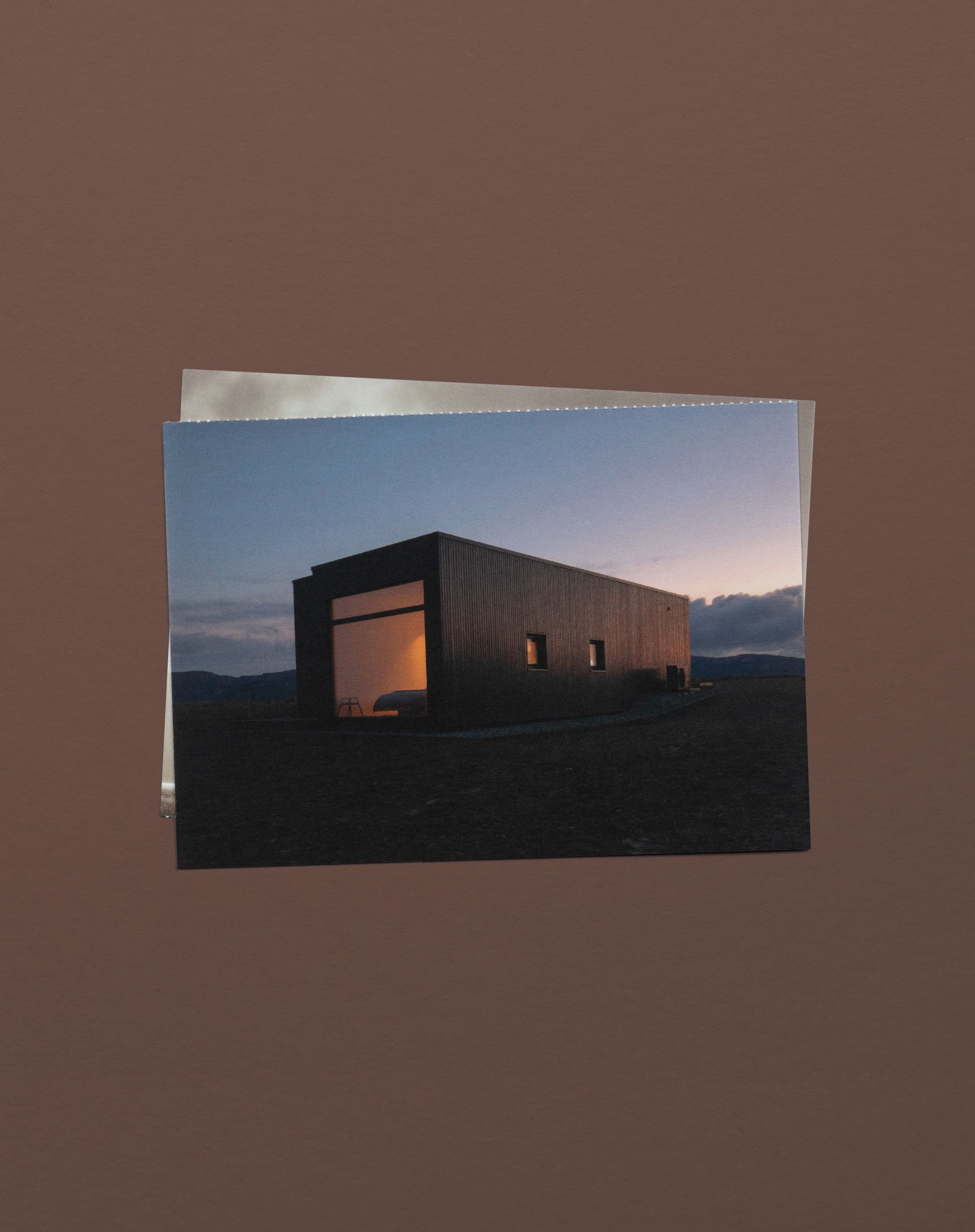
The project considered all components of the brand, from concept through to application. We wanted each touchpoint to reveal something about the stay, and this informed the design details. From a set of postcards to the brand’s website, each touchpoint was an opportunity to enhance the guest experience.
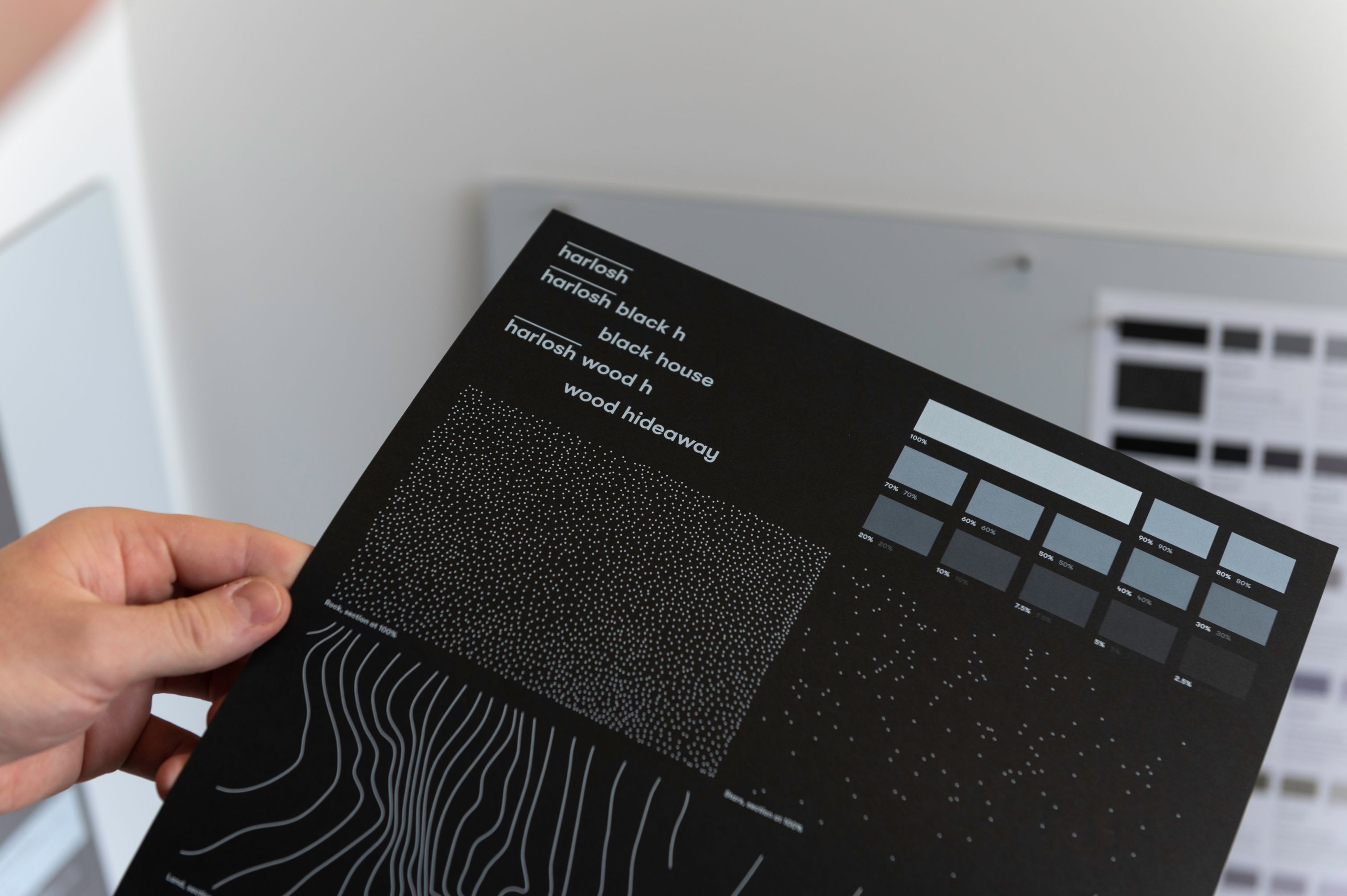
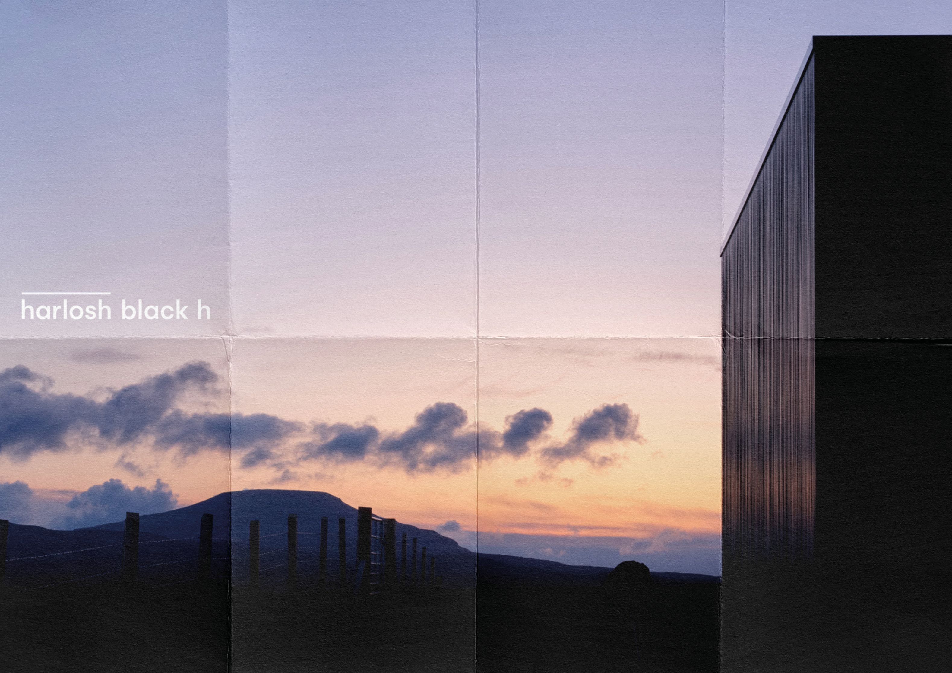
The identity we created for Harlosh Black h and Harlosh Wood h aimed to reveal. The meaning of the ‘h’ extends through the brand application: house, horizon, hideaway — variables of the name that give context through the touchpoints.
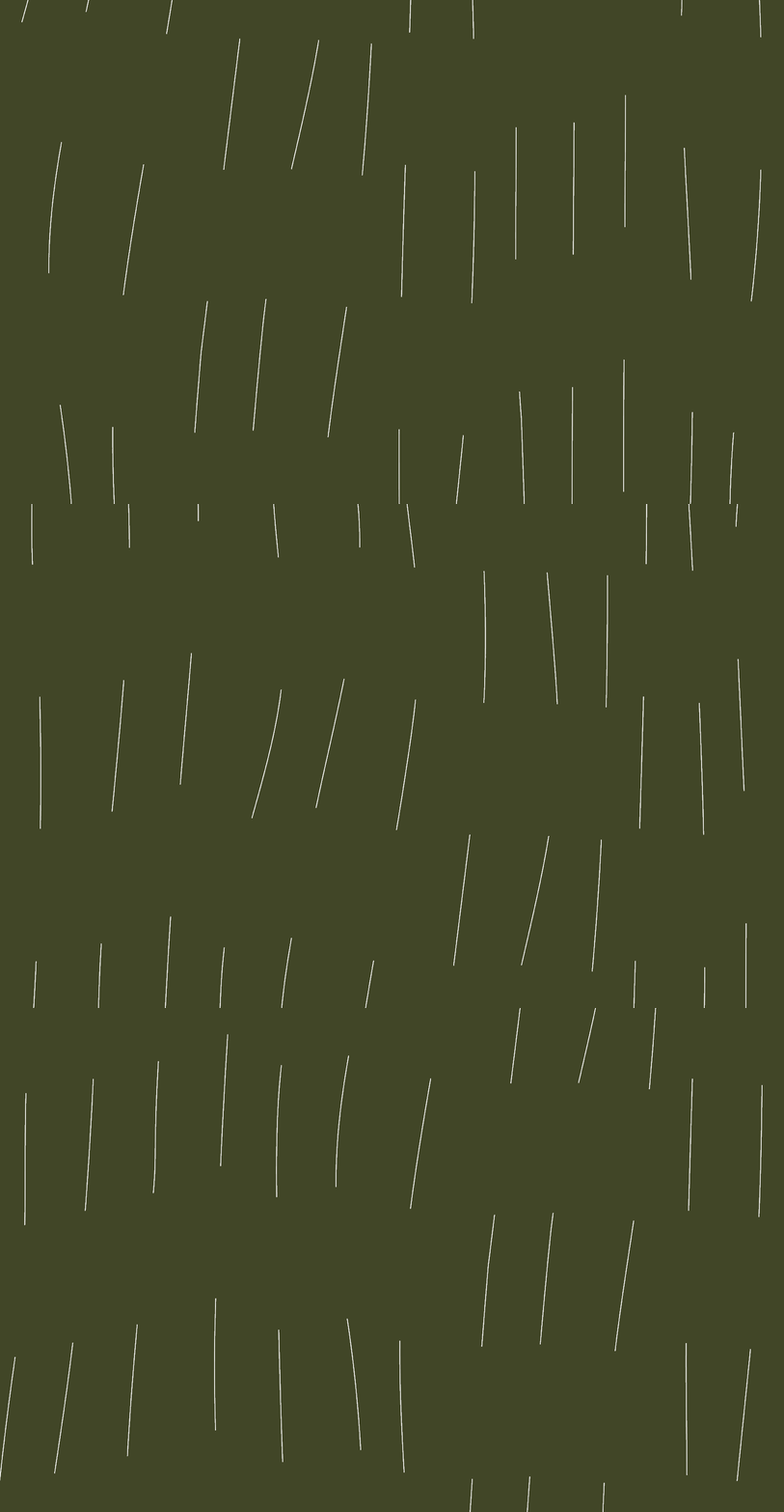
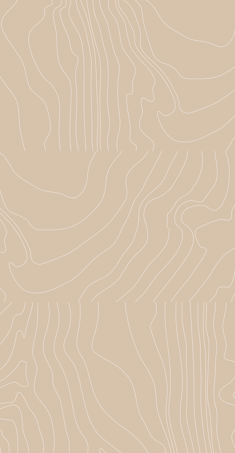
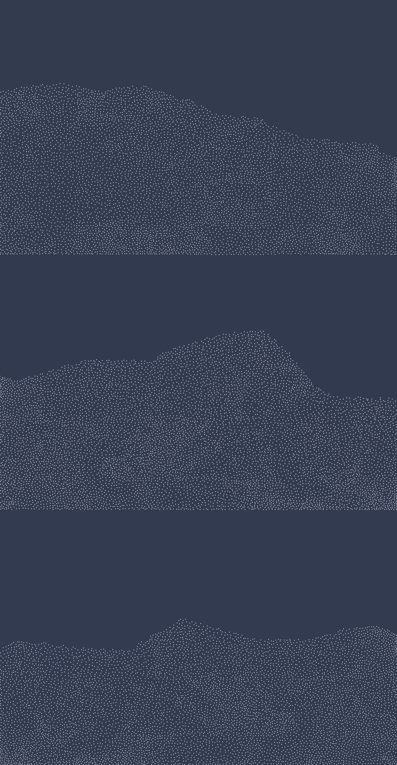
Four textures were created to evoke a sense of the landscape: rock, terrain, wind and night sky. The textures are used across the brand in a measured application: a cover, a pause between content and to bookend.
A colour palette was developed to pair with the textures. We drew inspiration from the houses and surrounding landscape of Black h and Wood h.
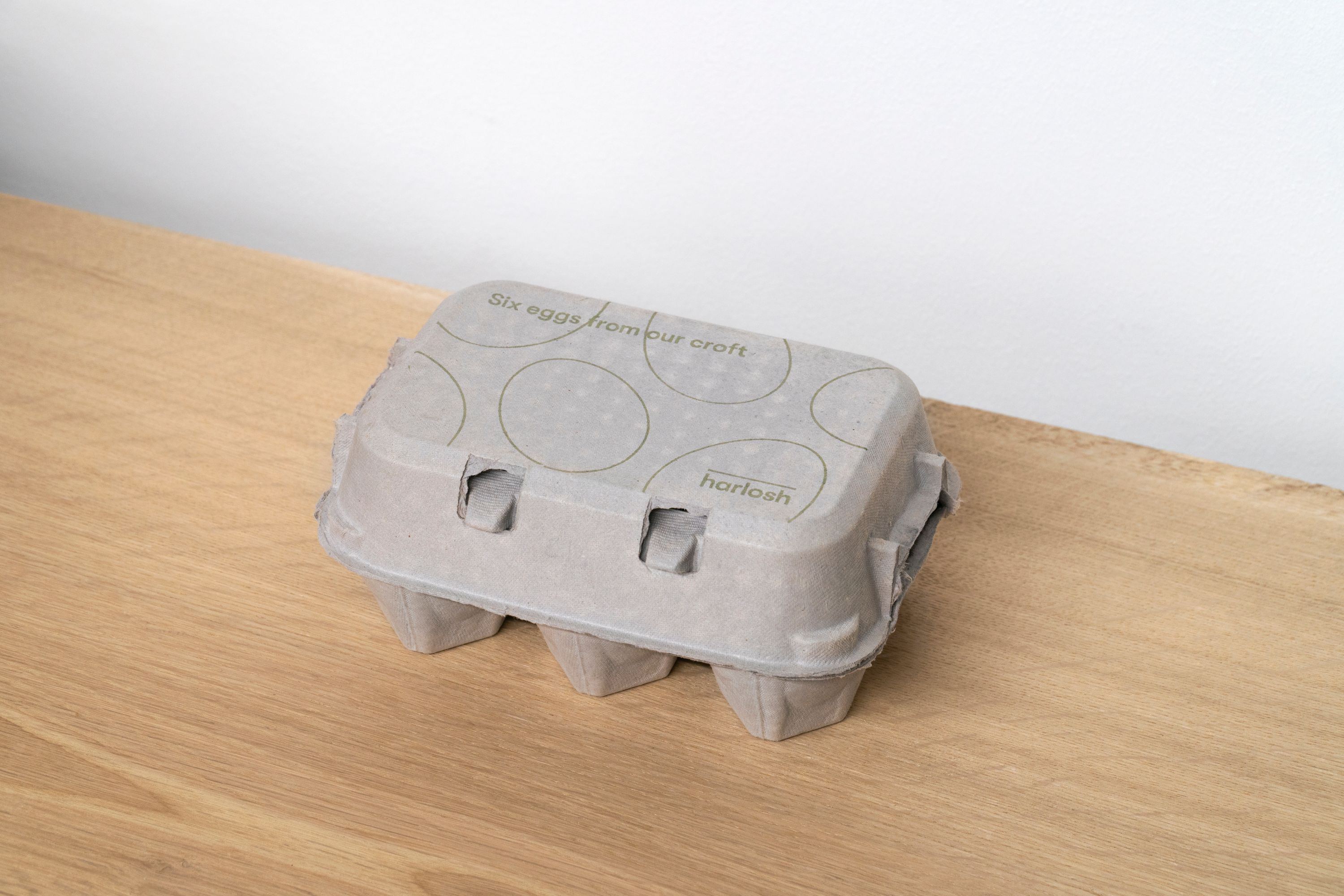
There were a number of touchpoints created, each designed to engage with guests at different points during their stay: signage, a welcome pack, maps, guides and an egg box.
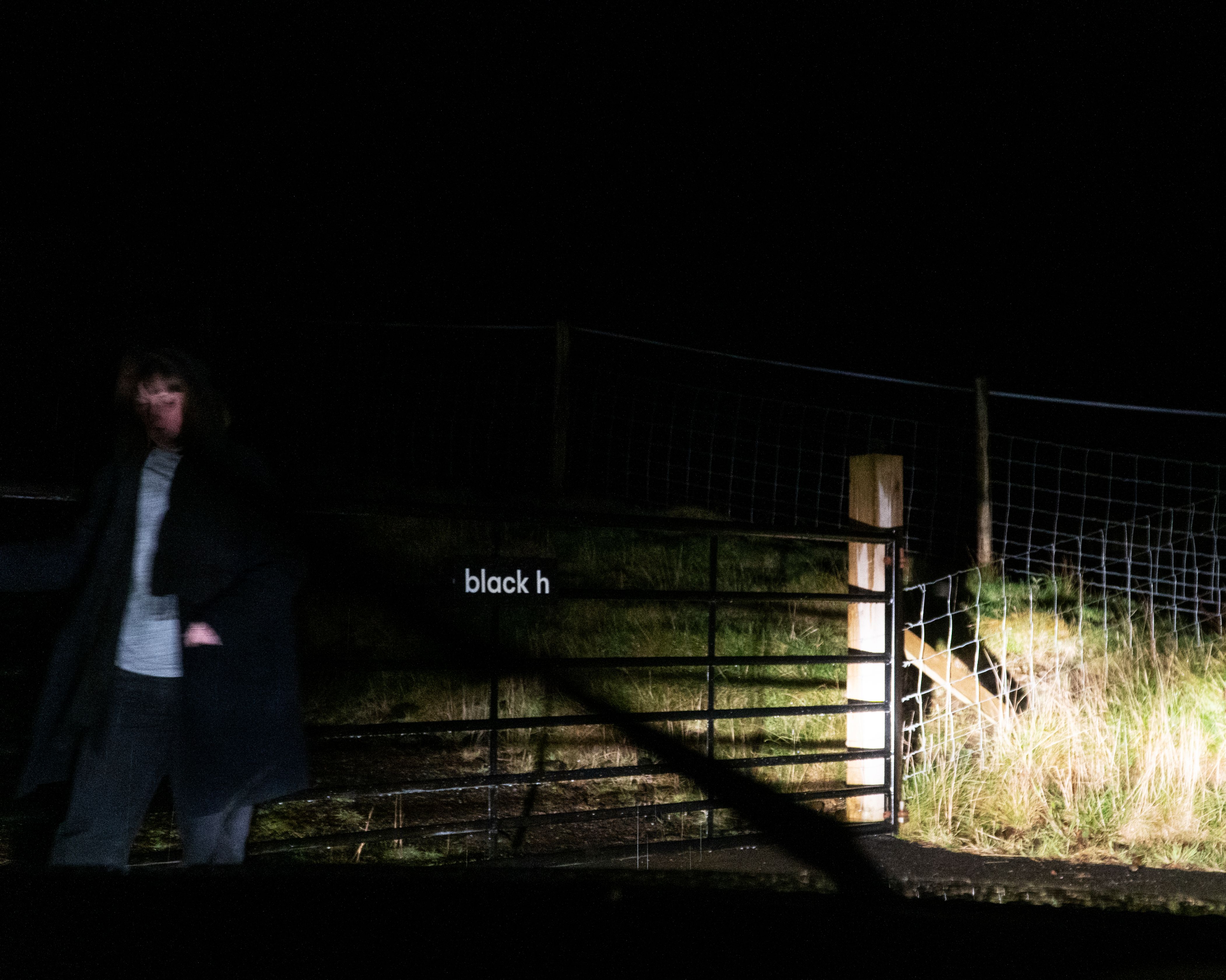
To counter the wild weather on Skye, a hardy solution was created for the gate signage using an aluminium panel with a channel system on the reverse to ensure a long-lasting solution. For printing across the identity, we utilised HP Indigo — an ideal choice for smaller print quantities and for its ability to print white ink onto each substrate.
Maps were created as part of the welcome pack and house notes to guide and direct guests to the accommodation.
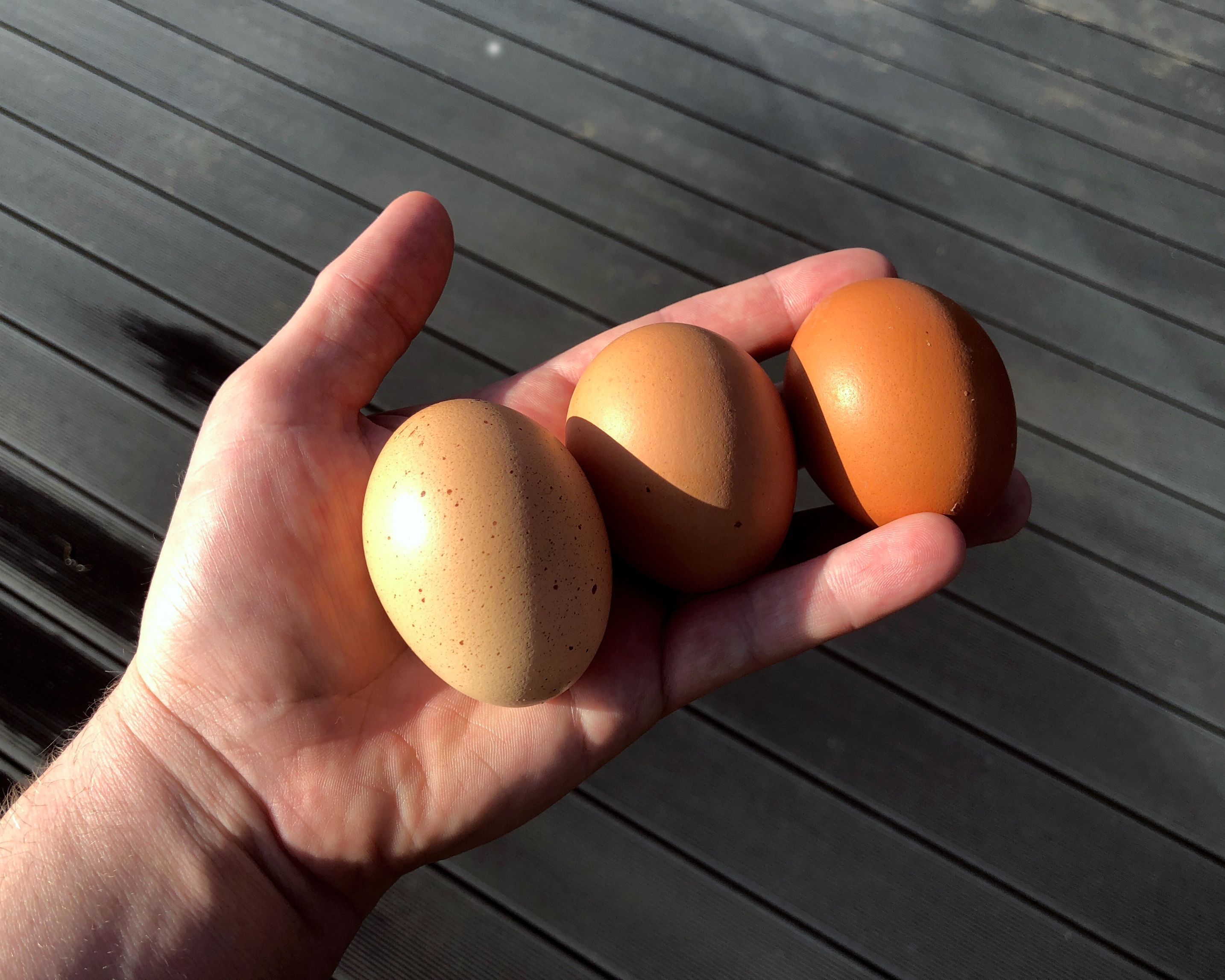
As part of the welcome pack, a box of eggs from the owners’ croft is provided for guests. Three stamps were produced, as well as a number of possibilities to create a playful piece of artwork for the lid.
Client
Harlosh
Location
Isle of Skye, Scotland
Project scope
Brand identity, Art direction, Website design, Packaging design, Photography, Print design, Signage
